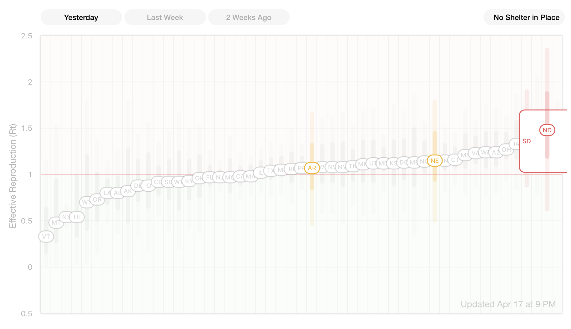
Instagram founders Kevin Systrom and Mike Krieger have teamed up to launch their first product together since leaving the Facebook mothership. Rt.live is an up-to-date tracker of how fast COVID-19 is spreading in each state.
“Rt” measures the average number of people who become infected by an infectious person. The higher above the number 1, the faster COVID-19 races through a population, while a number below one shows the virus receding. For example, Rt.live displays that Georgia has the highest, most dangerous Rt score of 1.5 while New York is down to 0.54 thanks to aggressive shelter-in-place orders.

Krieger tells me that “Kevin has been writing and publishing open-source data analysis notebooks on how to calculate Rt on a daily basis. We wanted to take that work and visualize it so anyone can see how their state is doing at curbing the spread.” Krieger had meanwhile been pitching in by building SaveOurFaves, a directory of local Bay Area restaurants that are selling gift cards so patrons can keep them afloat during quarantine. Built with his wife, the Kriegers open sourced it so people can build similar sites for their communities.
Rt.live shows that as of yesterday, Texas and California are at or just under 1 and Vermont has the best score at 0.33. The charts over time reveal how Washington and Georgia were successfully fighting COVID-19, dipping beneath 1 until the virus bounced back recently. Data is sourced from the COVID Tracking Project and you can examine Rt.live’s modeling system on GitHub.
“As states decide whether and how to open back up, they’ll have to manage their infection rate carefully, and we hope dashboards like rt.live will be helpful in doing so” Krieger says. By better illustrating how even small differences in shelter-in-place policy and compliance can exponentially change the severity of the impact of the virus, it could help convince people to stay inside. This kind of tool could also be helpful for determining where it’d be safe to reactivate some businesses, and quickly catch if virality is spiking and strict social distancing needs to be reinstated.
One fascinating feature of the site is the ability to filter by region so you can see how the Western states are doing better at suppressing COVID-19 than those in the South. You can also view the states with no shelter-in-place orders to see they’re doing worse on average. The charts could help identify how different political orientations and their subsequent policies translate to infection outcomes.

It might seem out of character for the photo app moguls to be building a medical statistics site. But Systrom has long studied virality as part of his work that helped Instagram grow so fast. He began publishing his own statistical models for tracking coronavirus infections and deaths on March 19th. “We’d been talking about ways of working together and this came out of that — my first job out of school was actually doing data visualizations / analysis at Meebo so a blast from the past in more ways than one” Krieger tells me. While Systrom did the data analysis, Krieger built the site, mirroring their old front-end and back-end Instagram roles.
“We built Rt.live because we believe Rt — the effective infection rate — is one of the best ways to understand how COVID is spreading” Kreiger explains. “It was great to work together again — we were able to take it from idea to launch in just a few days because of all our history & shared context.”
Powered by WPeMatico


