We know all of the words, and we know what they mean. “Respect,” the 1965 hit single from the queen of soul, Aretha Franklin, wields impressive staying power in the collective conscious—so much so that in the three years since Franklin’s passing at age 76, there have been numerous tributes, celebrations, and critical examinations of her life.
Most recently, the biopic Respect has brought the magic of Ms. Franklin back to the forefront. Starring the fantastic Jennifer Hudson, this film chronicles the singer’s life from childhood as she launches into career stardom, battling inner and outer demons and evolving along the way. Though her songs can be queued up at a moment’s notice (they continue to resonate with everyone from Boomers to Gen Zers), Hudson and Tony Award–winning costume designer Clint Ramos propel Franklin’s unique sense of style into the spotlight in this standout film.
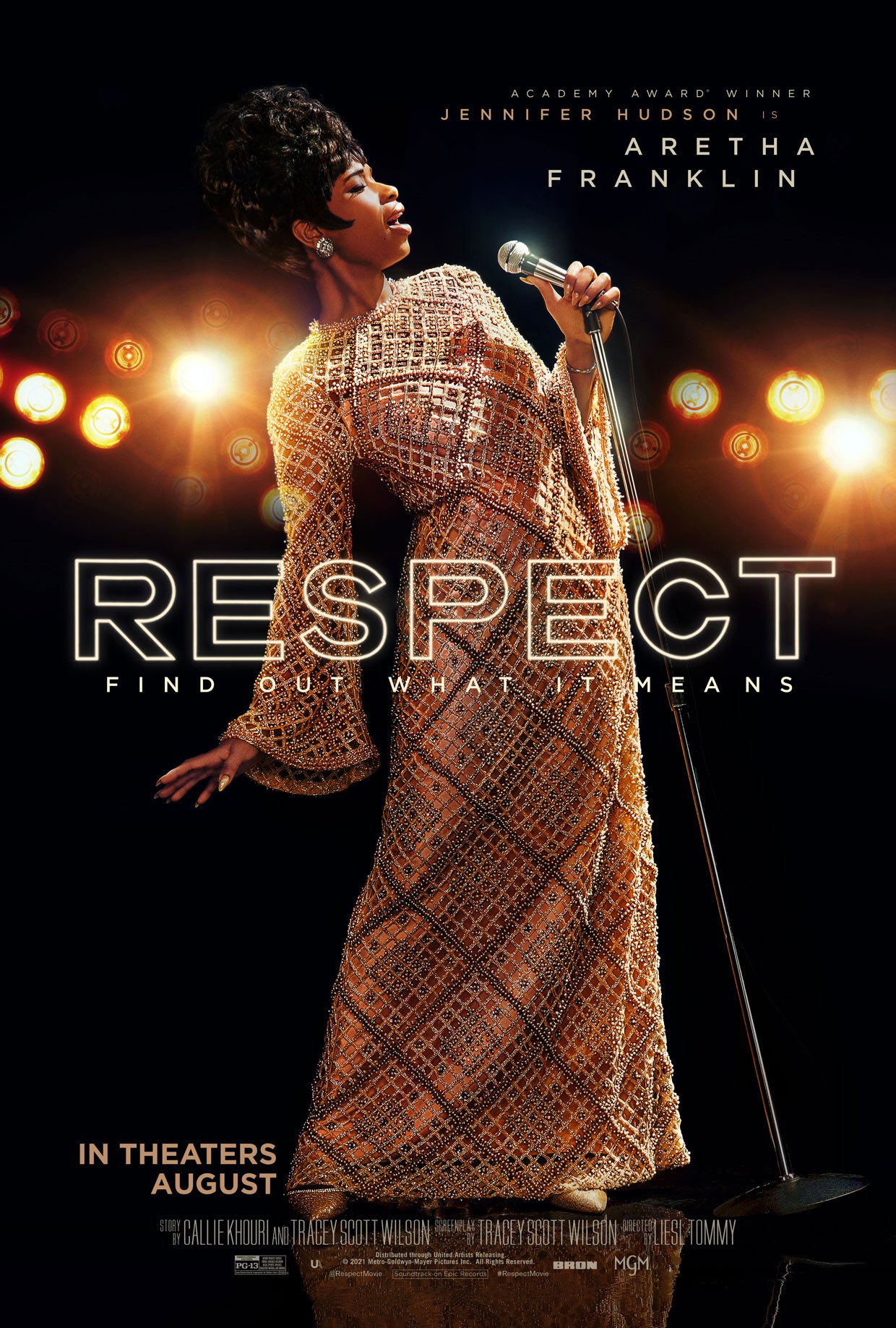
As he has a background in live theater, this feature film (which was recorded prior to the COVID-19 pandemic and the shuttering of Broadway) was a first for Ramos. An epic undertaking, Respect features a large cast, including famous faces from the music industry, the Civil Rights era, and re-creations of legendary performances. Fortunately, the four-decade time span combined with the theatrical nature of Franklin’s concerts was an appropriate challenge for Ramos, whose keen eye created costumes that not only suited the historical time and place but that also celebrated both divas—Franklin and Hudson—on-screen.
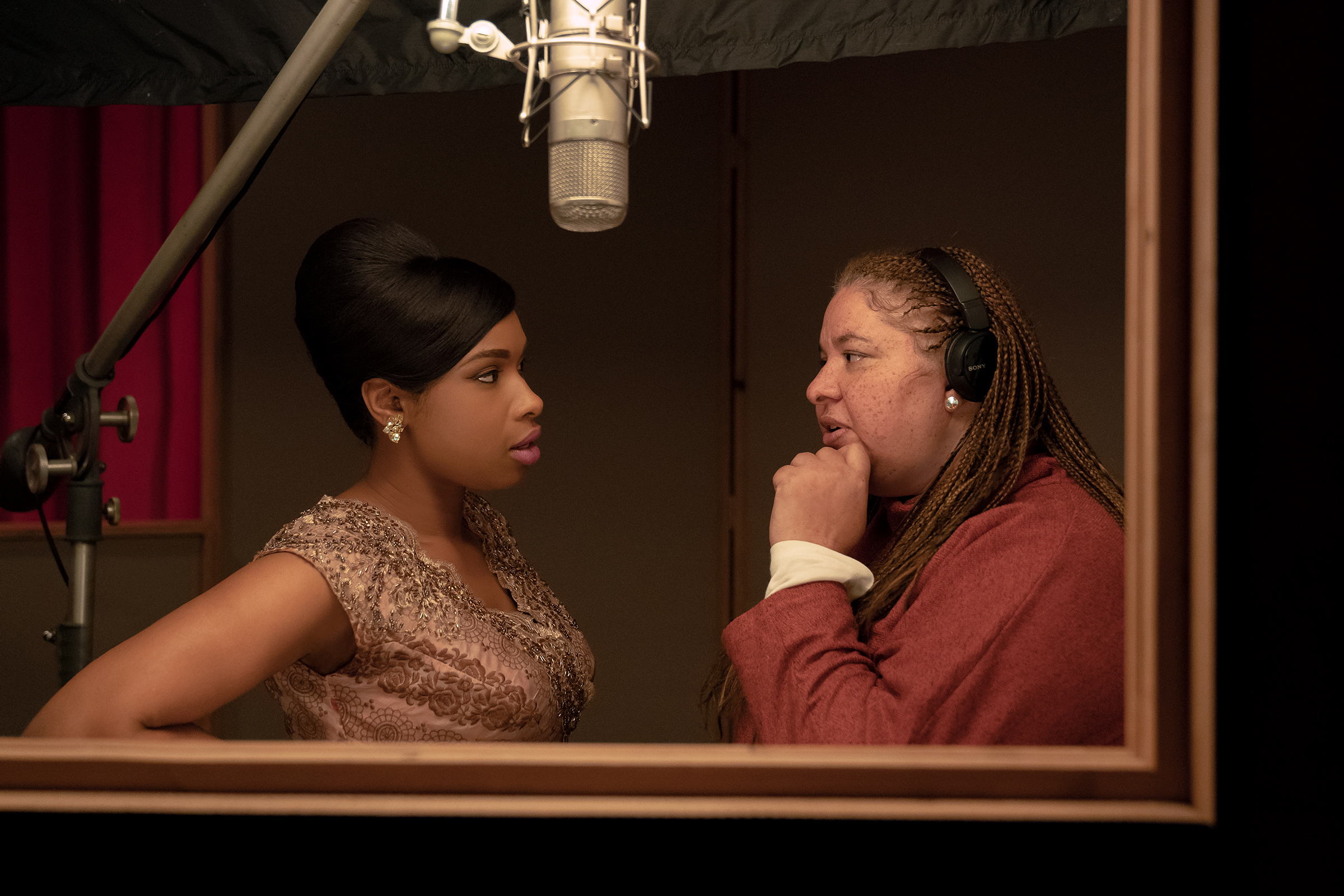
How was designing costumes for a film different from working in live theater?
Actually, there are a lot more similarities than differences. Costume design isn’t necessarily about fashion; it’s more really about character and storytelling. The theater has trained me to really look at it that way, so before any sort of lifestyle or glamour, you need to have an understanding of human beings.
There really wasn’t any difference, except in the sense of scale. [For Respect] we had these massive scenes with background actors—churches that were filled with hundreds of people and concerts at Madison Square Garden with over 1000 people to dress. It was really just about preparing myself for what that kind of scale required in terms of support and planning.
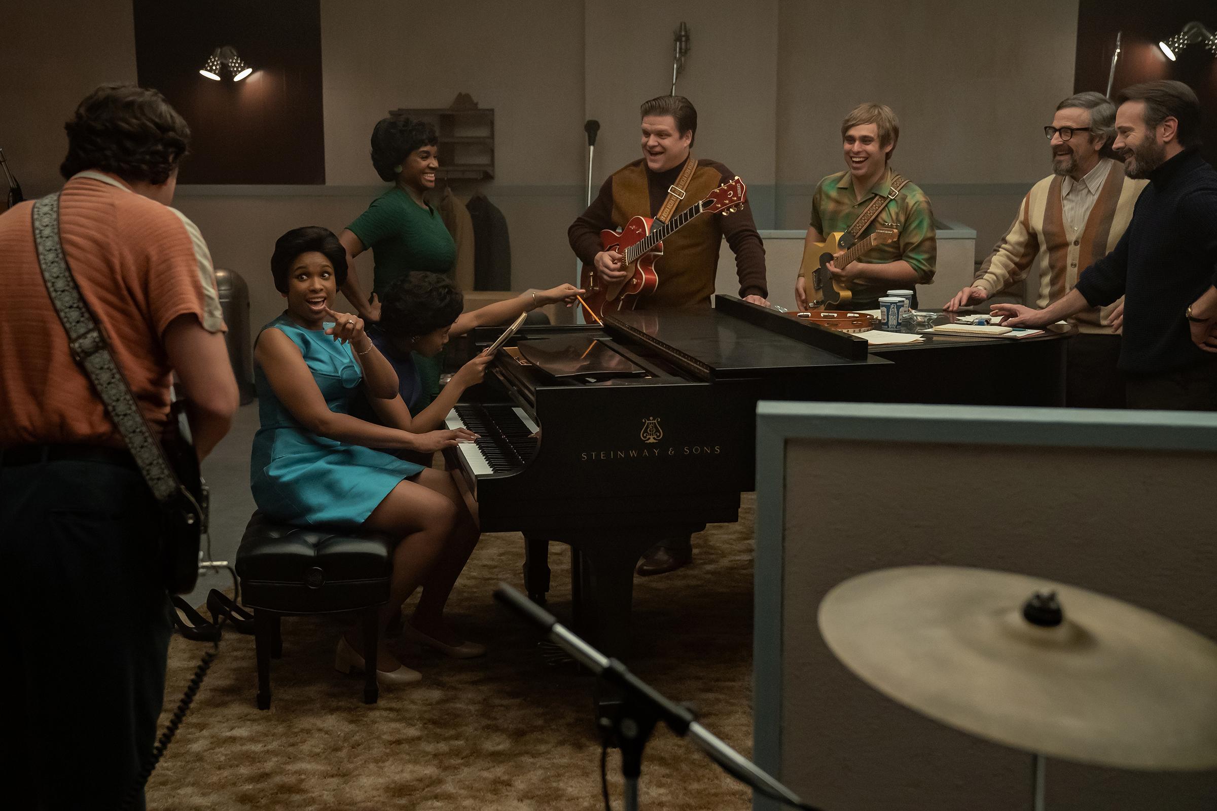
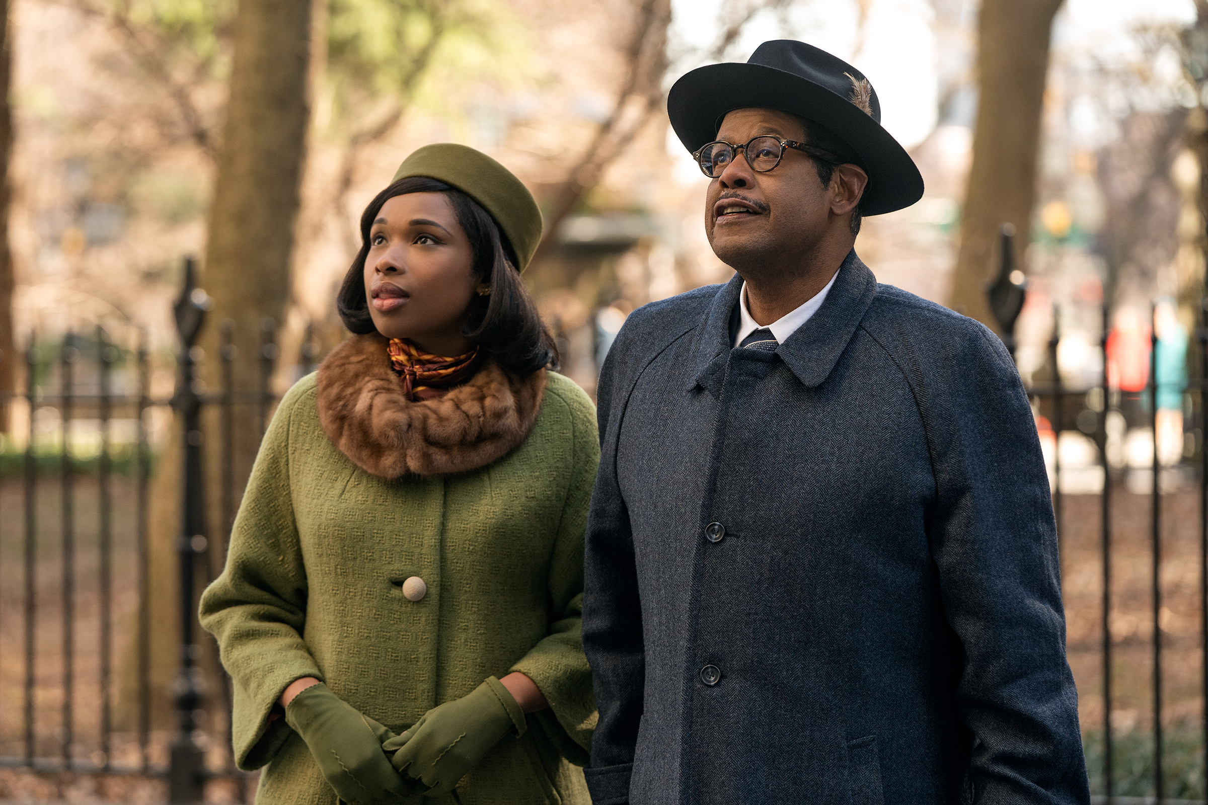
What did you enjoy most about designing for a young woman and performer in the ’60s and ’70s who was known for her unique sense of style?
What sets Aretha apart from her contemporaries is that she was not a mannequin. She was not subject to fashion on fashion’s terms and literally used clothing to express who she was and what her politics were.
There were many moments in her life that she actually took the fashion industry to task, even before we had a consciousness about size inclusivity. In the ’70s and ’80s, she called out brands like Calvin Klein and Versace and literally told them that they needed to make bigger dresses. It was important for me to show that this was a woman who actually used clothing, fashion, and appearance to telegraph who she was and what she valued.
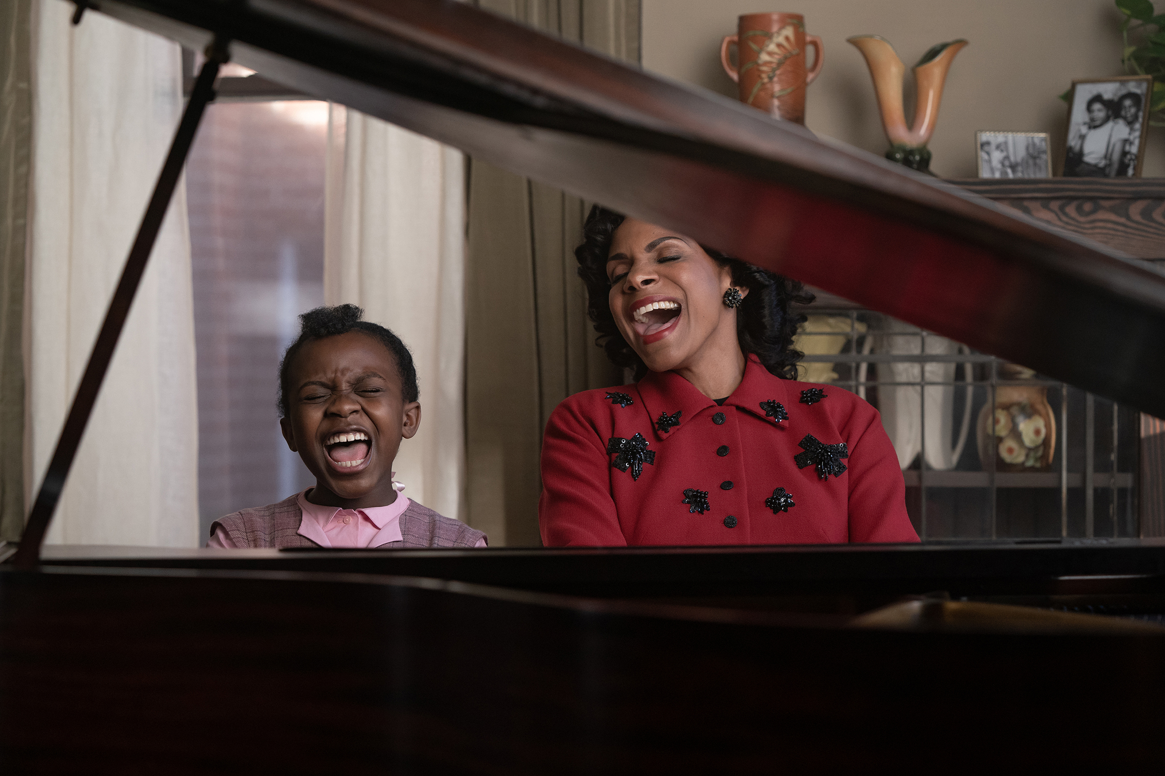
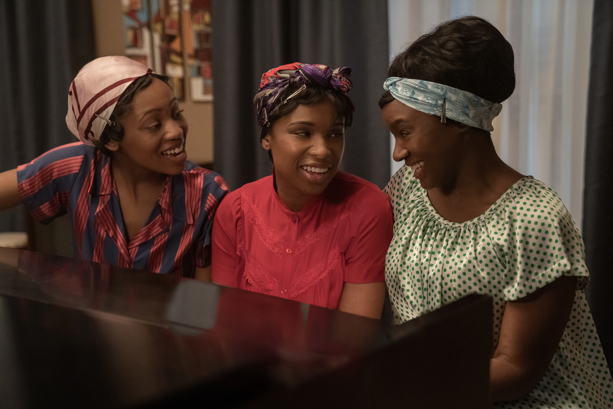
In her younger years, before she has her first taste of fame, Franklin frequently wears red, while her sisters wear green and yellow. What were you looking to convey with this repeated color palette?
Scarlet is either the color of bravery or the color of shame. We first locate that color through her mother, who was independent, who freed herself from an abusive marriage. So while red plays a really important role in the character’s trajectory, so does white, which reflects a yearning for innocence lost. It’s using color psychology to convey what Aretha has been through and the challenges she faced at a very young age.
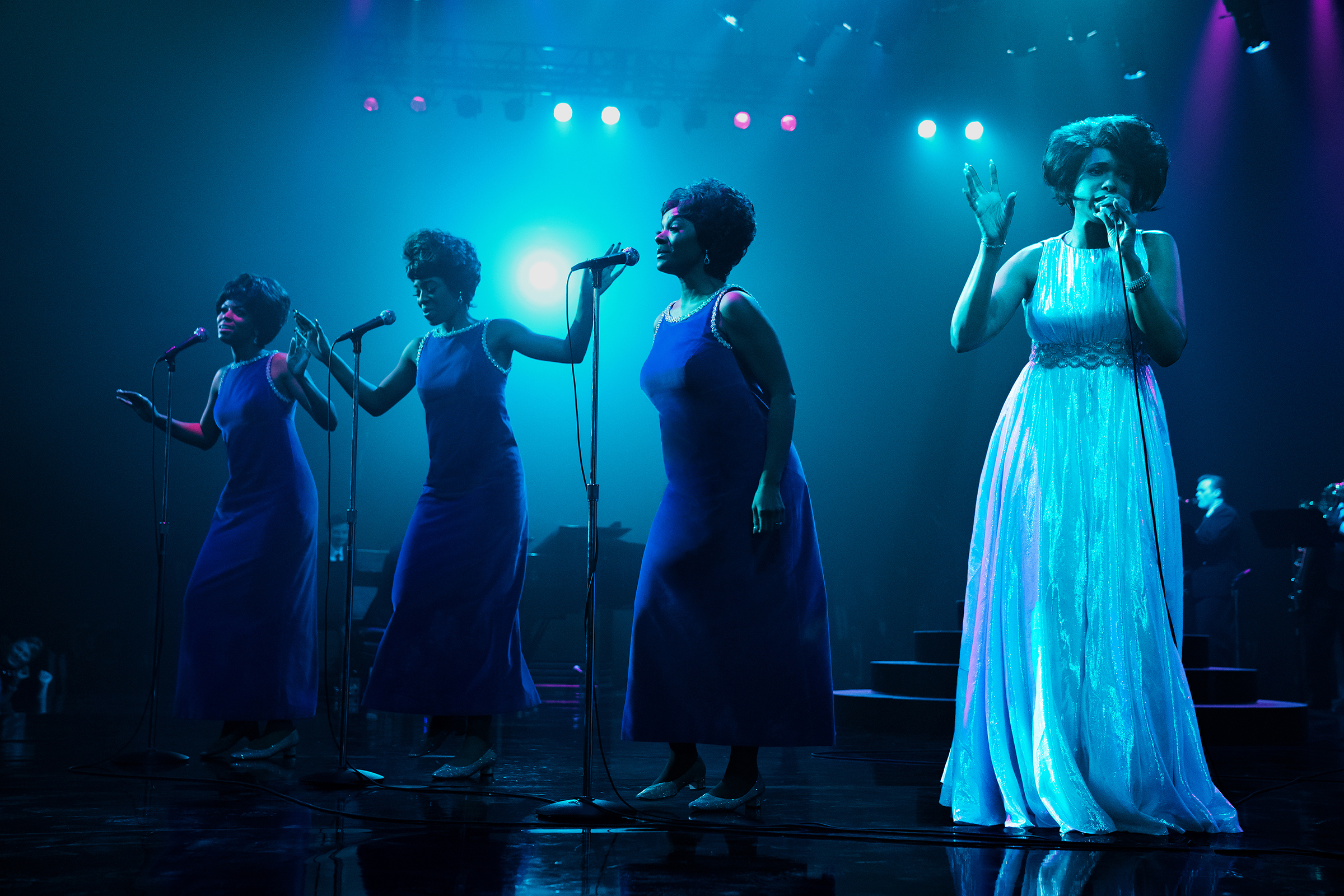
How much did you reference real events like the Madison Square Garden concert and the Amazing Grace documentary? Was it more important to stay true to what was documented, or did you take some liberties there to make it fit the style of the film?
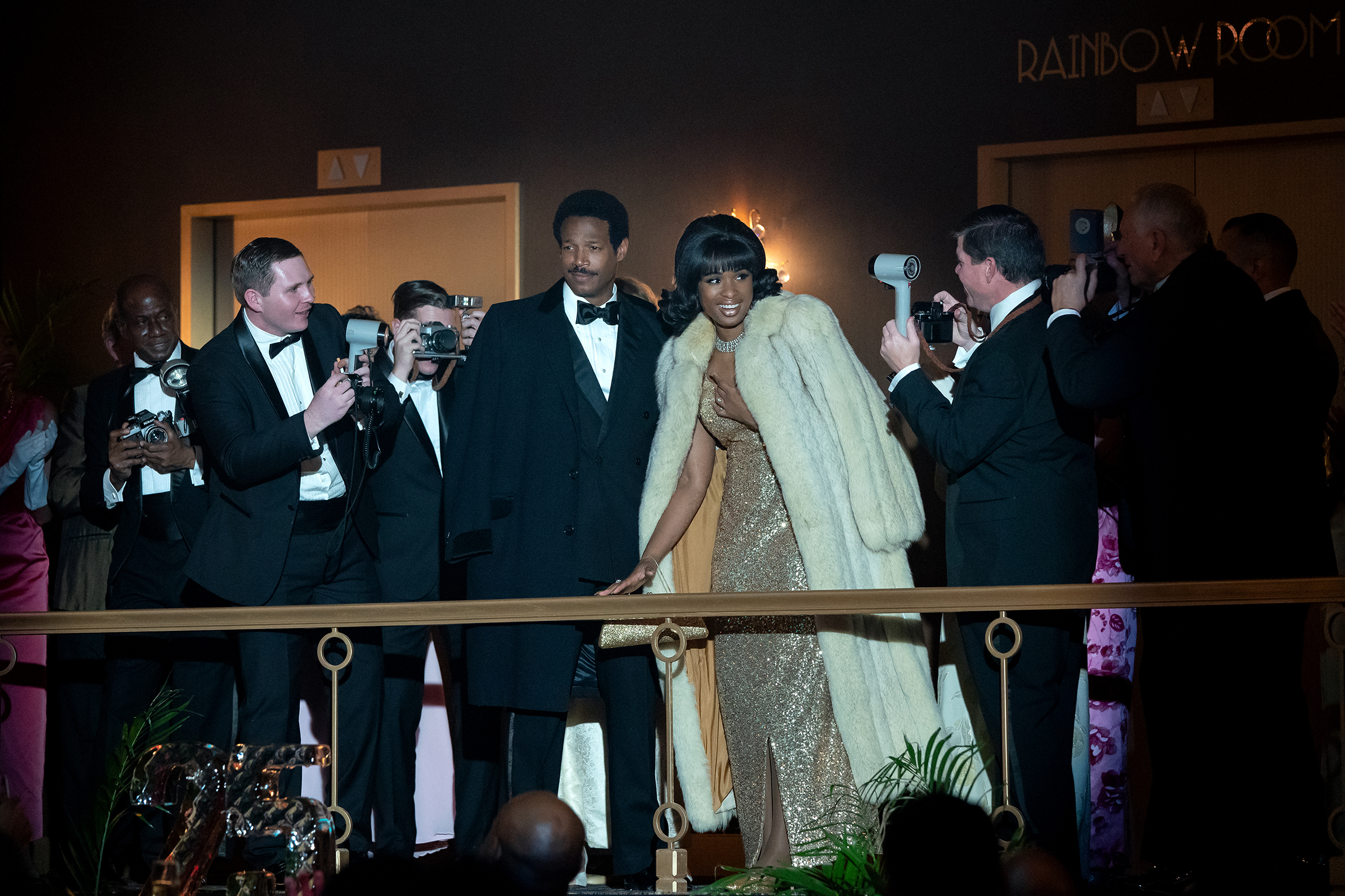
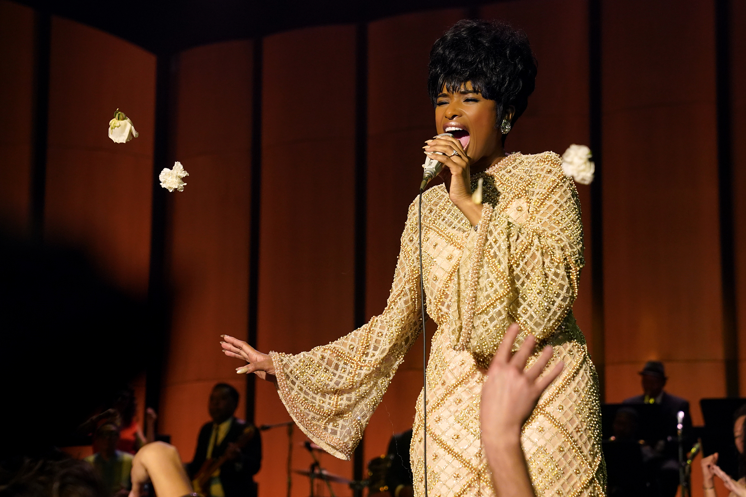
With regards to those iconic scenes, we wanted to make sure that the costumes reflected the event but also adjusted them to suit Jennifer [Hudson] and fit with the particular color trajectory of the film. For instance, in the MSG scene, I adjusted the fabric and lowered where the dress seams hit on the body. I wanted to show off the iridescence of the material because we filmed the concert scene as a theater in the round, and I wanted her to be this aurora borealis, this star in the middle of this dark cloud of people.
For the Amazing Grace dress, the documentary came out shortly before we started to film, and there were a lot of people who had seen it, so it was important that we didn’t veer too much away from reality. Instead of creating something totally new, I tweaked the proportions of the caftan and created a print of my own design to get the color a little bit closer to green rather than blue. That looked better with the lighting in the church and Jennifer’s skin tone. The overall look is updated but doesn’t stray too much from the original.
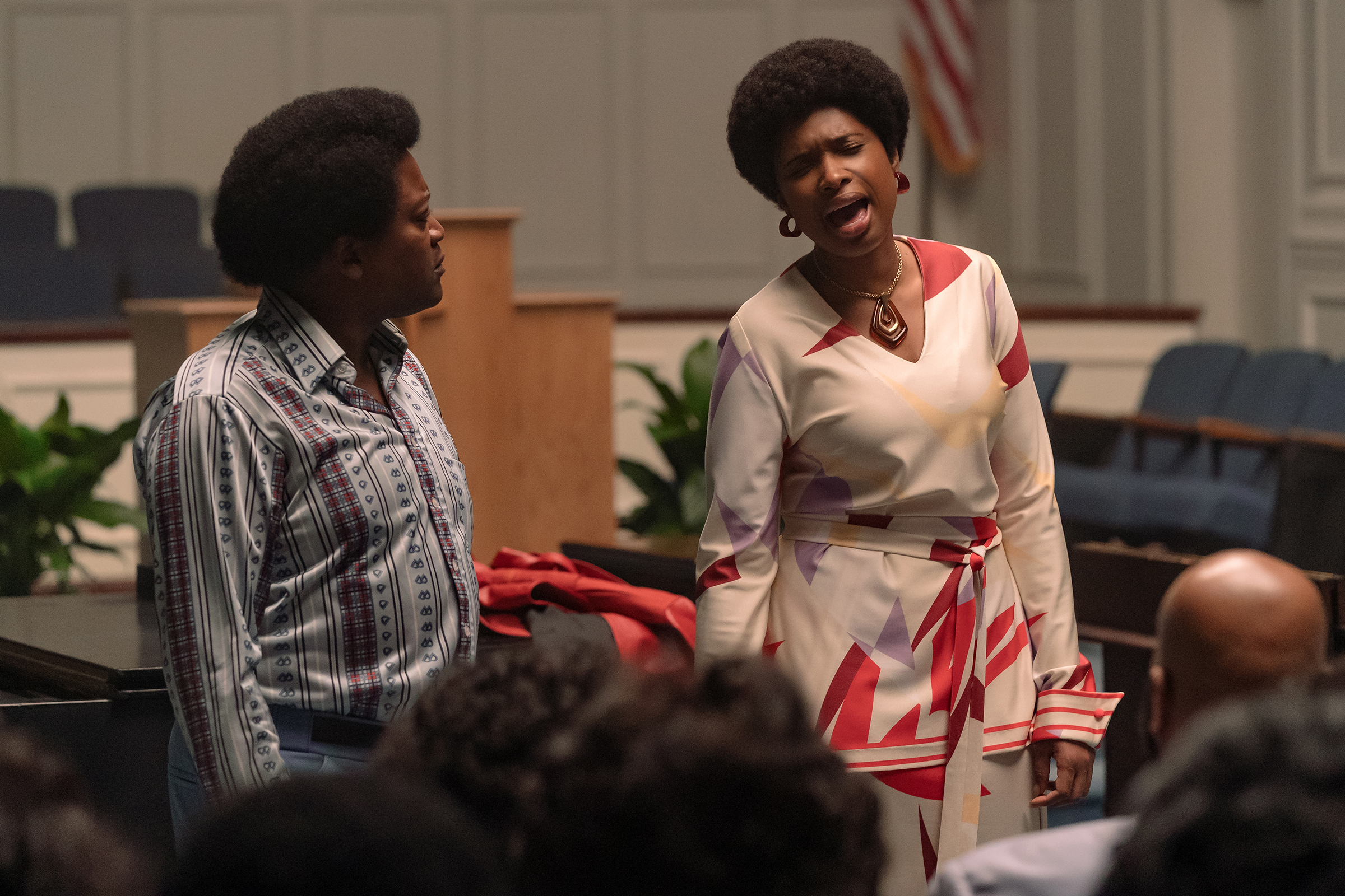
In the ’70s, Franklin gets more involved with the Civil Rights Movement from her own perspective and changes her style, embracing her natural hair and introducing leopard print into her wardrobe, which later becomes a signature. What did you make of this shift?
It’s period appropriate, but at the same time, it captures the moment that Aretha had come into this era of ferocity and rage. I had an image of her being trapped in a cage, so I wanted to invoke that restlessness and tap into the emotional core of those particular scenes. In terms of her personal life, it seems like Aretha felt more and more out of control as she was gaining control. To me, that moment spoke to that kind of animalistic sensibility and style that she adopts.
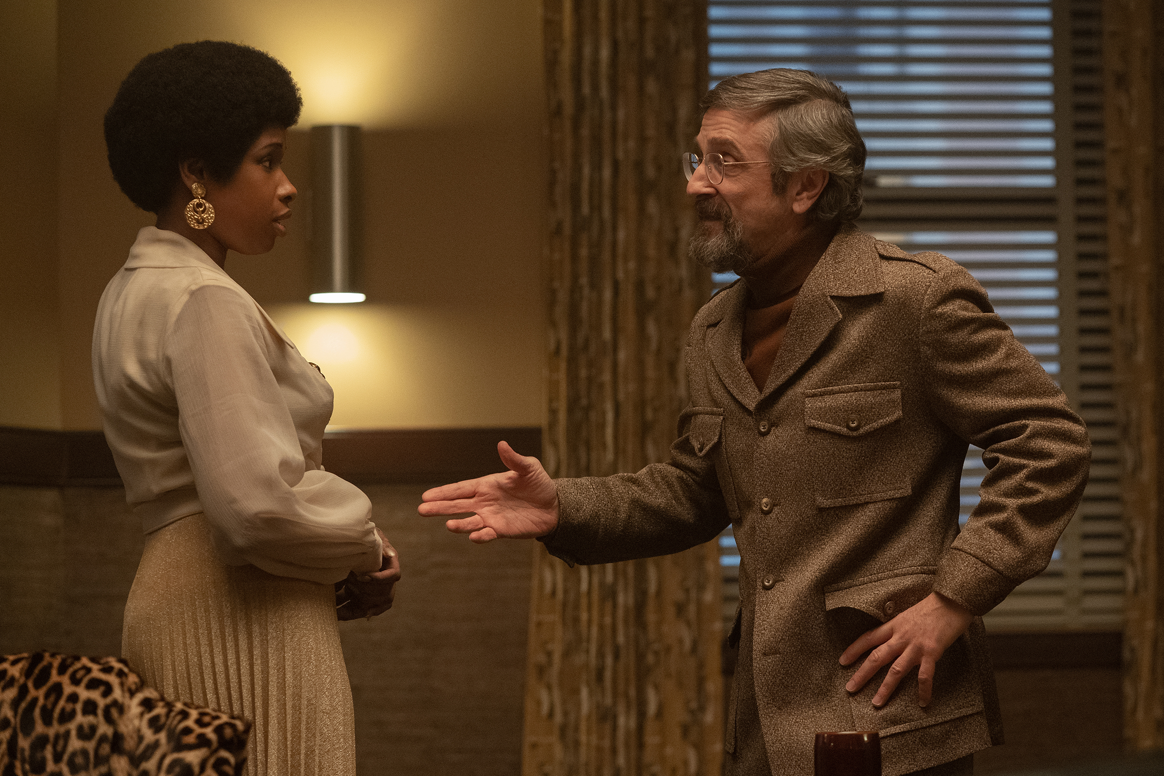
There were so many spectacular looks in the film, both inspired by real life and created especially for Jennifer Hudson. What was your favorite to design?
I love all of the looks that she had, from the high highs to the low lows, but the slip that she wears when she hallucinates her mother is really special. It’s nothing extraordinary, but it is where I feel like a costume really helps an actor get into a particular scene. I scoured the internet and the country for that slip, and when I found it, I knew it was the perfect thing. It really showed her vulnerability. And as far as Jennifer was concerned, she was really egoless about it to go there and be really raw and vulnerable in order to convey that state of dread.
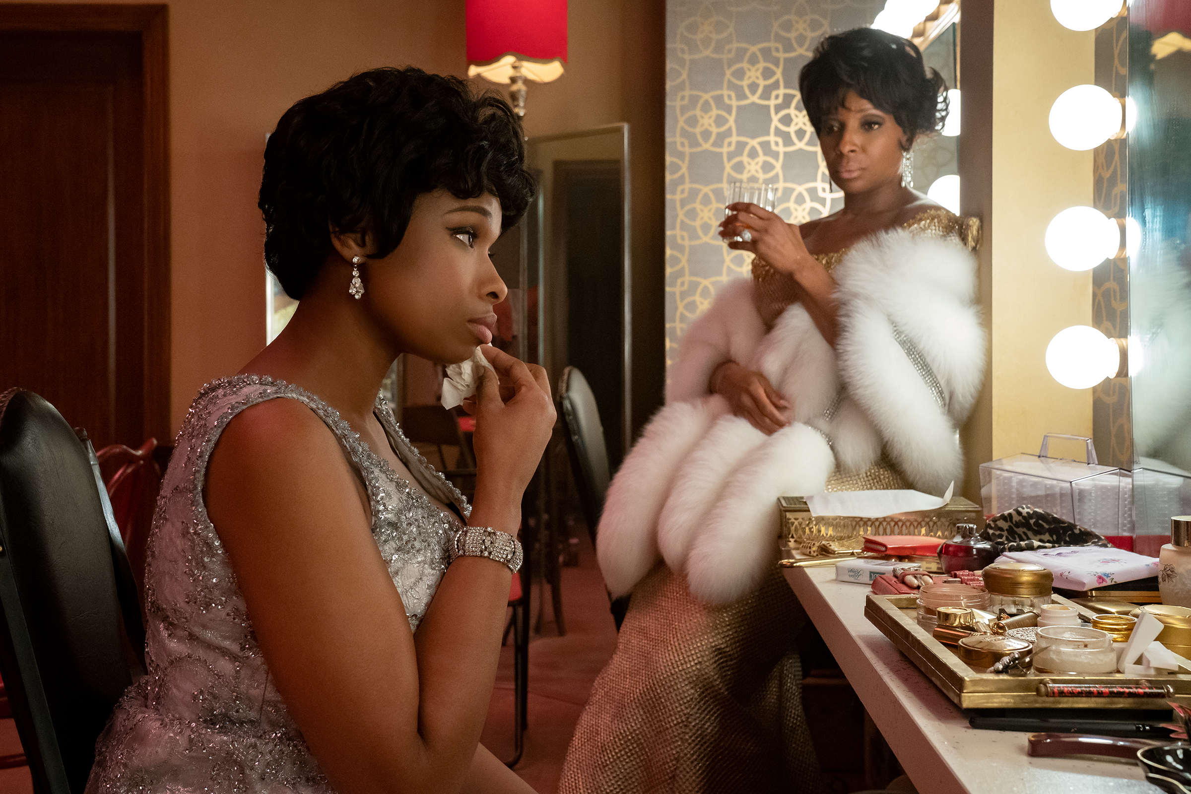
Other than Franklin, did you have a favorite character to dress?
The conversations that I had with Mary J. Blige during her fittings were spectacular. I love her character [singer Dinah Washington] because being a woman, particularly a Black woman at that time, everything about the way she dressed was really aspirational. There’s a sense that Dinah was the queen, right? She never took the risk of being underdressed—she always took the risk of being overdressed. I love how theatrical that was. Her looks really tapped into the theater of it all, a theater that’s created by fashion. So while the general outfits were based on what Dinah really wore, those costumes were a lot of fun to conjure up.
Up Next: From the 1920s to the Future: Lovecraft Country’s Costumes Are a Feat of Fashion
Powered by WPeMatico


