Your startup’s homepage should accomplish two things well: (1) Clearly explain exactly what you offer and (2) Convert visitors into active prospects.
If visitors leave confused or your website isn’t able to convert, allocate the resources to fix it before worrying about marketing.
When building your startup’s website, start by getting inspiration from the websites of established companies in your industry. Why? Because larger companies will have the resources to test and optimize their website to convert, saving you the need to do figure it all out yourself.
This post is going to tear down the homepage of Zapier, a SaaS platform that now has millions of customers and integrates with over 3,000 apps.
This teardown covers all the key sections of Zapier’s homepage so that you can apply the conversion tactics and copywriting strategies to your startup’s homepage.
Grab attention early with these three tactics
The above-the-fold (ATF) section of a homepage is the first section users see before they begin to scroll. It’s important that you nail this section, because if it’s not compelling, the rest of your landing page won’t be read.
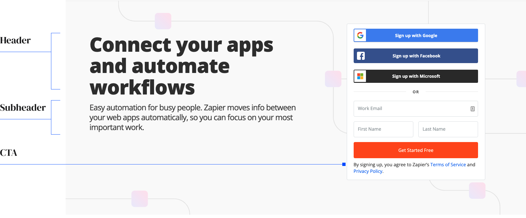
Zapier’s ATF section has three pieces that we’ll dive into individually: header, subheader and a call to action.

Image Credits: Demand Curve
A descriptive header with no jargon
The purpose of the header is to explain what your startup does and why it matters. It needs to be easy to understand at a glance. One of the biggest mistakes we see startups make is trying to make their header clever. Opt for clarity, not cleverness if you care about getting customers. The best headers can accomplish this in about 10 simple words.
Zapier explains what their product does in three words: “Connect your apps.” Then, they explain why it matters in two words: “Automate workflows.” The implication is that you’ll save a lot of time if you use Zapier.
Help TechCrunch find the best growth marketers for startups.
Provide a recommendation in this quick survey and we’ll share the results with everybody.
When crafting your header, start by writing at least 10 variations and share them with friends and colleagues who don’t work in your industry. Your header should be simple enough that anyone can understand what you sell. Avoid industry jargon unless it’s a primary competitive advantage.

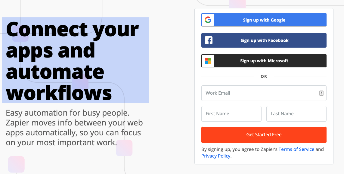
Image Credits: Demand Curve
A subheader that describes the transformation your customers go through
The header and subheader should complement each other. The header explains what you do, while the subheader explains how you do it.
The less information you ask your visitor to provide, the higher the conversion rate will be.
The subheader should add credibility to the claim made in the header by explaining how your company will accomplish the promise of the header. Explaining how it works is critical for conversion so that visitors know you have a real solution to their problems that has been thought through.
Again, avoid technical jargon in the subheader. You’re trying to pique your reader’s interest, not pitch to them.
Powered by WPeMatico


